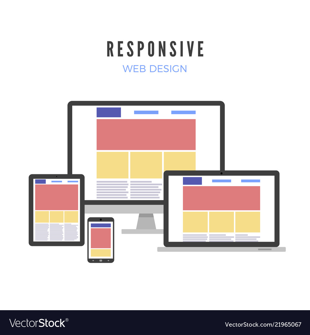
Websites are important nowadays for every service. And the most important aspect of a functional website is its responsiveness. It automatically adjusts the web contents to the different screen sizes.
Let us delve more into what is responsive web design in this article.
What Is Responsive Web Design?
Responsive web design is a modern approach that automatically adapts page contents with different screen resolutions.
We know that the aspect ratio or screen size of a desktop and a mobile phone is not the same. Also, not every mobile phone and tablet comes with the same screen size. So, a web developer can’t design a particular website for every screen. This is where responsive design comes in.
With the help of CSS(Cascading Style Sheet) Media Query, a designer can trigger an automated adjustment behavior of a web page. As a result, the web content adjusts itself according to the different screen sizes.
Because of responsiveness, you see a website differently on mobile and a desktop. Responsiveness is not a built-in characteristic of a website. To make your site responsive, you can help the web design and development services online.
Why is Responsive Web Design Essential?
The success of a website is in its ease of access and navigation. People will be visiting your website from different devices. Normally, most of the websites are well optimized for desktop versions.
But, if the website contents break down while visiting from mobile devices, people will be uncomfortable navigating. Then again, sometimes, an unresponsive website may not be in a usable format on other devices.
So, it is necessary to make sure that the contents adjust to every device the users are visiting from. Otherwise, it may result in a low conversion ratio. People are more keener on flexibility. Any complexity can be a deal-breaker for the visitors. You can discuss this in detail with Webagentur Zug
How to Check Whether Your Website is Responsive or Not?
Checking for website responsiveness is easy from a desktop computer. For this quick inspection-
- Open Google chrome
- Go to your website
- Press Shift + Ctrl + I to get to the Chrome DevTools
- Press Ctrl + Shift + M to get to the device toolbar
- Alternatively, you can press on the “Mobile/Tablet” device icon on the top right corner
- Now inspect your website from a mobile or tablet perspective
When you inspect the site from other device resolutions, you will find the screen parameters at the top. You can toggle between different resolutions to check whether it is okay on other devices.
If the contents break apart in various resolutions, you need to look for the responsiveness issues on your website.
Example of Responsive Website
If you are still unclear about the whole concept, here are the 5 examples of a responsive website. It should make things clearer to you.
Adobe
This is what the Adobe website looks like in the Desktop version.
This is how the website looks on iPhone 12. You can see that the contents adopted the screen resolution.
The top menu bar was horizontal on the desktop version and showcased all the options. But, in the iPhone 12’s version, the menu got collapsed into a hamburger icon. The menu expands and collapses when you click it.
If you are using Mozilla Firefox, you can simply press Shift + Ctrl + M to see your website from a mobile perspective.
How Can I Make My Website Responsive?
If you are a developer, you must know how to make a website responsive. But if you are not, there is always room for hiring some experts to do the task for you.
You can hire a freelancer from the best marketplaces or consult with an online service provider.
However, the developers use CSS and HTML to fully responsive sites. If you are not into coding, it is better to leave it for the experts.
A quick tip for you- if you are making a site with ready templates, try to purchase responsive ones. It will save you a lot of time and money.
Final words
So, now you know how important it is to have a responsive website. It is better to make sure that your site adapts to other devices when you launch it. The user’s comfort around the UI and UX should be the first priority because they are the key roleplayer in the success of your business.
Many people lack knowledge of what is responsive web design. So they can not realize the real significance. But, when you are aware of it, you can beta test the website while your developer is working on it. So you can easily inspect and instantly ask for fixes.


